Mis trabajos

Professional Headshots for The Lanzaga’s Founding Team

In the early days of The Lanzaga, a South American restaurant in Chicago, I had the privilege of photographing the people who brought it to life — the chef, the host, and the barista. These weren’t just headshots. They were portraits infused with character, professionalism, and warmth ✨.

From the chef’s focus in the kitchen to the barista’s craft and the host’s welcoming vibe — my goal was to honor their roles and unique personalities through intentional, well-lit composition.

🎯 Why it matters: First impressions count. Authentic headshots don’t just present a face — they tell a story. Especially in hospitality, where human connection is everything.

📩 Looking for authentic portraits for your team? Let’s talk

🗣ESPAÑOL: Retratos profesionales para el equipo fundador de The Lanzaga

Tuve el honor de capturar en retratos al chef, al host y al barista de The Lanzaga, en sus inicios. Cada fotografía fue pensada para reflejar su rol y su esencia con calidez y profesionalismo.

En el mundo de la hospitalidad, una buena imagen comunica mucho más que apariencia.

📸 ¿Tu equipo necesita fotos auténticas y profesionales? Contáctame

El Starbucks más grande del mundo está en Chicago – ¡Te lo muestro en mi nuevo video!

¿Sabías que el Starbucks más grande del mundo está en Chicago? En mi nuevo video de YouTube te llevo a recorrer el impresionante Starbucks Reserve Roastery, un lugar único para los amantes del café, el diseño moderno y la buena vibra de la ciudad.

¿Qué verás en el video?

Exploro todos los pisos del Starbucks Reserve ubicado en la famosa Michigan Avenue, donde cada nivel ofrece una experiencia diferente. Es una parada obligatoria si estás visitando la ciudad o si eres fanático del café de especialidad.

➡️ Mira el video completo aquí:

Jake’s Lakeshore Adventure: A Stunning Chicago Dog Photoshoot

Meet Jake, a six-year-old rescue dog from PAWS Chicago. He’s a unique mix of Treeing Walker Coonhound and Border Collie, with an adventurous spirit and a heart full of love. His recent dog photoshoot near Chicago’s Lakeshore perfectly captured his energy and personality.

📸 A Perfect Day for a Lakeshore Photoshoot
Jake’s session took place along Chicago’s beautiful lakeshore, at the Beach dog in Chicago. The natural lighting highlighted his expressive eyes and striking coat, making each shot vibrant and full of life.

🐶 Jake’s Personality Shines Through
As a mix of hound and collie breeds, Jake is both intelligent and curious. During the shoot, he explored the area with excitement, pausing only to pose for some breathtaking portraits. His playful energy combined with moments of quiet reflection created a diverse and dynamic photo gallery.

🏙️ Why Choose a Lakeshore Dog Photoshoot?

  • Iconic Chicago scenery enhances your pet’s portraits.

  • Open spaces allow for natural and relaxed shots.

  • Stunning lighting brings out the beauty in every pet.

Book Your Chicago Dog Photography Session!
If you’d love professional dog portraits of your furry friend, let’s capture their unique spirit in a stunning outdoor setting. Contact me today to schedule a pet photoshoot in Chicago!

Golden Doodle Photography: Capturing Ruby’s Charm at 11 Years Old

Are you looking for a professional Golden Doodle photography session? Meet Ruby, an adorable 11-year-old Golden Doodle who recently had a heartwarming photoshoot. Capturing senior dogs is a special experience, as it preserves their gentle expressions and loving personalities forever.

📸 The Magic of Senior Dog Photography
Senior dogs like Ruby have a unique charm, with wise eyes and a lifetime of memories behind them. During this dog portrait session, Ruby’s playful yet calm nature shined through, making every shot truly special.

🏡 The Perfect Setting
For Ruby’s photoshoot, we chose a peaceful indoor location that complemented her soft golden curls. Natural light enhanced her beautiful fur, creating warm and timeless portraits.

🐶 Why Book a Golden Doodle Photoshoot?

  • Celebrate your pet’s life and unique personality.

  • Capture high-quality images to cherish forever.

  • Create stunning wall art or keepsakes.

Book Your Pet Photography Session Today!
If you have a Golden Doodle or any other beloved pet, don’t miss the chance to create lasting memories. Contact me today to schedule your professional dog photography session!

The Creation of the AdrianVisual Logo: A Unique Brand Identity

Building a Brand from Scratch

A well-designed logo is essential for any brand looking to establish a strong presence. As a photographer and videographer, I wanted a logo that reflected my creative vision while maintaining a sleek and professional aesthetic. This is the first time I’ve created a logo for myself, making this process an exciting challenge in branding and graphic design. The goal was to design a visual identity that was both minimalist, elegant, and instantly recognizable

The Design Concept

The AdrianVisual logo was developed with careful attention to balance, readability, and branding impact. Key design elements include:

  • Typography Selection: The foundation of my logo is a bold, sans-serif typeface that exudes clarity and strength. I chose uppercase letters to ensure maximum legibility and impact, making it easy to recognize across different media.

  • Icon Integration: To reinforce the audiovisual theme, I incorporated a filmstrip icon, symbolizing the artistic and cinematic approach that defines my work both for photography and videgraphy. The yellow (gold) accent not only creates contrast against the black-and-white typography but also adds a touch of creativity and energy to the brand

  • Balanced Layout: The composition ensures a visually harmonious design, adaptable for digital and print use.

  • Tagline Placement: Positioned for clarity and legibility across different formats and screen sizes.

Final Thoughts

Creating a brand logo from scratch is a crucial step in defining a business identity. The AdrianVisual logo represents my commitment to professionalism and creativity, ensuring a recognizable and cohesive visual presence.

Designing Impactful Business Cards: Your Visual Identity in Hand

Today, I want to share the graphic design process behind my card, both front and back, and how each element was strategically chosen to communicate my professionalism and creativity.

In the competitive world of photography and videography, an effective business card is essential to make a lasting impression. As a visual storyteller, I understand the power of a strong brand identity, and my business card is an extension of my commitment to visual excellence

The Front: The Clapper Board, a Symbol of Audiovisual Professionalism and Direct Contact

Business card front with film clapper board background, Adrian Sanchez name, photographer/videographer title, phone and email icons, and website cursor

  • Concept: The front of my card needed to immediately convey my expertise in the audiovisual industry. The iconic film clapper board was the perfect choice, a universal symbol of video and photo production. Additionally, I wanted to facilitate direct contact with potential clients.
  • Design: I used a high-resolution image of a clapper board as the background, creating a visually striking and relevant design. My name and title, “Adrian Sanchez, Photographer / Videographer,” are presented in a clean, sans-serif typeface, ensuring legibility and professionalism. Contact information, including my phone number and email, is clearly organized, with intuitive icons for easy identification: a phone for direct calls and an envelope for emails. Furthermore, a cursor icon invites visitors to my portfolio website.
  • Color Palette: A dark color scheme with white text creates a sophisticated and professional look, ideal for a professional photographer and videographer.

The Back: Your Visual Portfolio at a Glance

 Business card back with QR code, visual storyteller description, Instagram handle, and film strip with photography examples

  • Concept: The back of my card is designed to showcase my work and drive traffic to my online portfolio. A QR code provides instant access to my website, and a film strip displays examples of my photography and videography.
  • Design: A large QR code on the left side ensures easy scanning. A brief description of my services, highlighting my specialization in family memories and promotional videos for businesses, and my Instagram handle are placed to the right. A film strip at the bottom displays a selection of my best work, giving potential clients a glimpse of my style and experience in event photography and corporate videos.
  • Color Palette: The same dark background as the front maintains consistency. White text and a visually appealing color palette for the film strip ensure that the information stands out.

The Result: A Business Card That Opens Doors

My business card is a powerful tool for networking and promoting my brand. The front clearly communicates my profession in the audiovisual industry and facilitates direct contact, while the back showcases my work and directs people to my online portfolio.

I am proud of the design of my business card and believe it effectively represents my brand and my commitment to visual storytelling. If you are looking for a professional photographer or videographer to capture your special moments or boost your company’s visual presence, please contact me!

Lanzaga Bistro’s New Menu Design – Take a Look!

Exciting news! 🎉 I’ve designed new menus for Lanzaga restaurant, bringing a fresh and visually appealing look to their offerings.

🔍 Graphic Design:

The new menu design follows a modern chalkboard style, which gives it a warm and inviting feel. The bold typography and clear section divisions make it easy to navigate, ensuring customers can quickly find their favorite drinks and food items.

🎨 Color Scheme & Aesthetic

  • The black background mimics a real chalkboard, enhancing the bistro’s cozy atmosphere.

  • The combination of red, blue, green, and yellow headers adds vibrancy while maintaining a sophisticated balance.

  • High-quality icons and images of drinks and desserts create an appetizing visual appeal.

✏️ Typography & Readability

  • The mix of elegant serif and casual handwritten-style fonts adds character without compromising legibility.

  • Pricing is clearly aligned, avoiding clutter and ensuring an easy reading experience.

🏆 Final Thoughts

This design successfully blends aesthetics with functionality, offering a professional yet welcoming look. What do you think? Let me know in the comments! 😊

🗣ESPAÑOL: He diseñado los nuevos menús de Lanzaga Bistro, dándoles un look fresco y visualmente atractivo. El nuevo diseño sigue un estilo de pizarra moderna, lo que le da una sensación acogedora e invita a los clientes a explorar el menú. La tipografía llamativa y las divisiones bien definidas hacen que sea fácil de navegar.

Este diseño logra una combinación perfecta entre estética y funcionalidad, brindando un aspecto profesional pero acogedor.

  • El fondo negro imita una pizarra real, reforzando la atmósfera acogedora del bistró.

  • La combinación de rojo, azul, verde y amarillo en los encabezados aporta dinamismo sin perder elegancia.

  • Íconos e imágenes de alta calidad de bebidas y postres hacen que el menú sea más atractivo y apetitoso.

Logo Refresh for Canticum Merú

Updating a logo is a delicate process that requires balancing tradition and innovation. In this case, I had the opportunity to refresh the logo for Canticum Merú, a female choir, maintaining its essence while giving it a more modern and refined appearance.

Old version:

Old logo of the female choir Canticum Merú, featuring blue and light blue typography, a treble clef, and a waterfall illustration

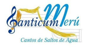
The original logo, used until 2020, featured multiple design elements, such as a detailed pentagram and expressive brush strokes. While these conveyed musicality and artistic expression, they made the logo visually complex.

Refreshed logo:

Updated logo of the female choir Canticum Merú, featuring blue and light blue typography, a treble clef, and a simplified waterfall illustration

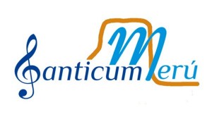
The new version focuses on simplicity, readability, and a fresh look, preserving the treble clef and the reference to Salto Ángel (Angel water falls) while streamlining the composition.

The main improvements in this redesign include:

Refined typography: The new font maintains elegance but improves clarity and readability.
Cleaner visual composition: Unnecessary elements like the pentagram and excessive strokes were removed for a more modern and versatile look.
Stronger conceptual identity: The treble clef remains as a core musical element, while the ochre stroke now represents Salto Ángel in a more abstract and fluid way.
Balanced color palette: The vibrant blue enhances the choir’s identity, while the ochre accent highlights key elements without overloading the design.

This update ensures that Canticum Merú has a logo that is visually appealing, easy to use in different media, and aligned with contemporary design trends.

🗣ESPAÑOL:

Actualizar un logo es un proceso delicado que requiere equilibrar la tradición con la innovación. En este caso, tuve la oportunidad de refrescar la imagen de Canticum Merú, un coro femenino, manteniendo su esencia pero dándole un aspecto más moderno y refinado.

El logo original, usado hasta 2020, contenía múltiples elementos gráficos, como un pentagrama detallado y pinceladas expresivas. Si bien transmitían musicalidad y expresión artística, también hacían que el diseño fuera visualmente complejo. La nueva versión se centra en la simplicidad, legibilidad y frescura, manteniendo la clave de sol y la referencia al Salto Ángel, pero con una composición más estilizada.

Con esta actualización, Canticum Merú cuenta con un logo más atractivo, fácil de aplicar en distintos formatos y alineado con las tendencias de diseño actuales.

De regreso a Youtube

Después de dos años de ausencia en youtube. Estoy de vuelta para seguir hablándoles de varios temas. En este video te comparto los nuevos tópicos que verás en mi canal:

Coffee Portraits: The Lanzaga Coffee

Capturing the Essence of Lanzaga Coffee – A Visual Journey

Photographing Lanzaga Coffee was a truly rewarding experience. Their commitment to quality begins with their air-roasting process, which enhances the natural flavors of the beans by preventing contact with metal—eliminating any burnt or metallic taste.

For this project, I focused on showcasing the rich textures, deep aromas, and craftsmanship behind every cup. From the carefully selected coffee beans to the expertly crafted drinks, each image highlights Lanzaga Coffee’s dedication to excellence. Their innovative roasting method ensures a smooth, clean taste, making every sip an experience worth savoring.

If you appreciate high-quality coffee and artisanal roasting, Lanzaga Coffee is a must-try.

🗣 Español:

Tuve el placer de capturar la esencia de Lanzaga Coffee, un lugar donde la pasión por el café se encuentra con la innovación. Utilizan el método de Air Roasting, un proceso que tosta los granos con aire caliente, evitando el contacto con superficies metálicas y resaltando la pureza del café.

Desde los granos recién tostados hasta las exquisitas tazas servidas, cada imagen refleja su compromiso con la calidad y el sabor. Fue una experiencia fotográfica tan rica y envolvente como el café que ofrecen.

Si eres amante del buen café, Lanzaga Coffee es una experiencia imperdible.

Food portratis for Bakery Le Petit Gateau in Indiana

I had the opportunity to travel to Carmel, Indiana, for a special photography project at Le Petit Gâteau, a charming French bakery that offers an irresistible variety of croissants, scones, muffins, bagels, and artisan breads.

It was a truly enjoyable experience to highlight the artistry behind each pastry and showcase the inviting atmosphere of this wonderful bakery. Here are some of my favorite shots.

They are located in 525 North End Drive, Carmel, Indiana 46032, and you can visit their website

🗣 Español: Tuve la oportunidad de viajar al estado de Indiana para hacer fotos a una pastelerìa francesa. Les dejo una muestra de mis capturas favoritas.

Food pictures to The Lanzaga restaurant

I’m glad to share with you my first photography project in the U.S.A. Last year, Lanzaga Restaurant opened its doors in Chicago’s Lakeview neighborhood. This vibrant spot offers a fusion of South American cuisine, featuring dishes from Venezuela, Colombia, Brazil, Peru, and influences from Argentina and Ecuador.

I had the pleasure of capturing the essence of their menu through photography. Here’s a small sample of my work, showcasing the flavors and artistry behind each dish.

To get more info about this restaurant, you can find them at thelanzaga.com

🗣 Español: El año pasado el restaurante de comida sudamericana The Lanzaga abrió sus puertas, y tuve la oportunidad de hacer fotos gastronómicas a sus platos.

Blog at WordPress.com.

Up ↑